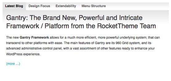
RokTabs is a tabbed content widget. Content is transitions, either by fade or scroll, and is powered by mootools. The widget has the ability to be fully automated, switching based on time or manually by user interaction.

Features
- Tabbed Content: Display multiple content items in a tabbed enclosure.
- Inbuilt Styling: Both light and dark styling for standalone support
- Configurability: Highly configurable from options dealing with transition, to content type and layout.
Configuration
Once activated, the RokTabs configuration panel can be found under the link RokTabs Settings in the Plugins SubPanel, rest of the settings are configured directly from the widget settings.
This is a breakdown of all the configuration options of RokTabs Settings Page:
Preset Themes: You can select between Light or Dark theme for the widget.
Icons Path: Sets the path where RokTabs will be searching for icons.
This is a breakdown of all the configuration options of RokTabs Widget Controls:
Posts Category: You can choose from which category posts should be displayed.
Type of Content: You can choose which part of post content should be displayed – content or excerpt.
Order: Sets the order in which posts should be displayed.
Number of Tabs: Sets the maximum number of tabs to display in RokTabs.
Tabs Position: Determinates where the tabs should be placed.
Width: Sets the width of the whole widget.
Links Margin: Adds extra margin to the tabs scrolling arrows.
Show Tab Icons: If post has RokTabs icon set in its settings, the icon will be displayed in the tab
Icon Position: Determinates where the icon should be placed in tab
Mouse Interaction: Changes how RokTabs reacts to mouse events.
Transition Duration: Sets the amount of time needed to switch between tabs.
Transition Type: Sets the transition type that will be used to switch tabs.
Transition Effect: Effect to be used durning the tab switching.
Enable Autoplay: Enables automatic tab switching.
Autoplay Delay: Amount of time between automatic tab switching.